
The following list provides information about the Text Fields, Drop-Downs, Buttons, and Check Boxes used in Online RMS.
Type information directly into the field.
Note: Some text fields are auto-complete fields, also called AJAX fields. When you place your cursor in an auto-complete field, the field turns yellow and acts as an auto-complete field by offering drop-down choices for selection. If the entry you want is presented, click it to pull it into the field.
Note: Some text fields provide spelling auto-correct options. This will appear as a red line under a word that does not appear in the software dictionary. Right-clicking a word or term that has been underlined will cause a dialogue box with suggested corrections to appear.
Click to the right of a field to display a list, then click a value to select it and pull it into the field.
There are different types of buttons: Function Buttons, Radio Buttons, and Floating Buttons.
Function buttons are used to initiate system functions. Examples of function buttons include, Quick Print, Print, Exit Report, Transfer, Exit Wizard, and Submit for Approval.
Only one radio button may be selected from a group (two or more displayed buttons).
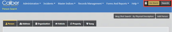
Floating action buttons appear on the top right of search pages for easy navigation without scrolling.
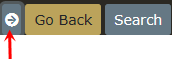
Click on the arrow to hide, and click on the arrow again to unhide.
Click the box to select (insert a check mark) or deselect (remove a check mark) to activate or deactivate an option, or to filter a list by one or more parameters.